
'Erebus’ is a new addition to the Spicers Wine & Gourmet Companion, a compendium of their range of narrow web self-adhesive stocks, used primarily in the packaging of wine, beer, spirits and gourmet foods. Each is approached as stand-alone packaging project expressing individuality and appropriateness to the relevant market segment.
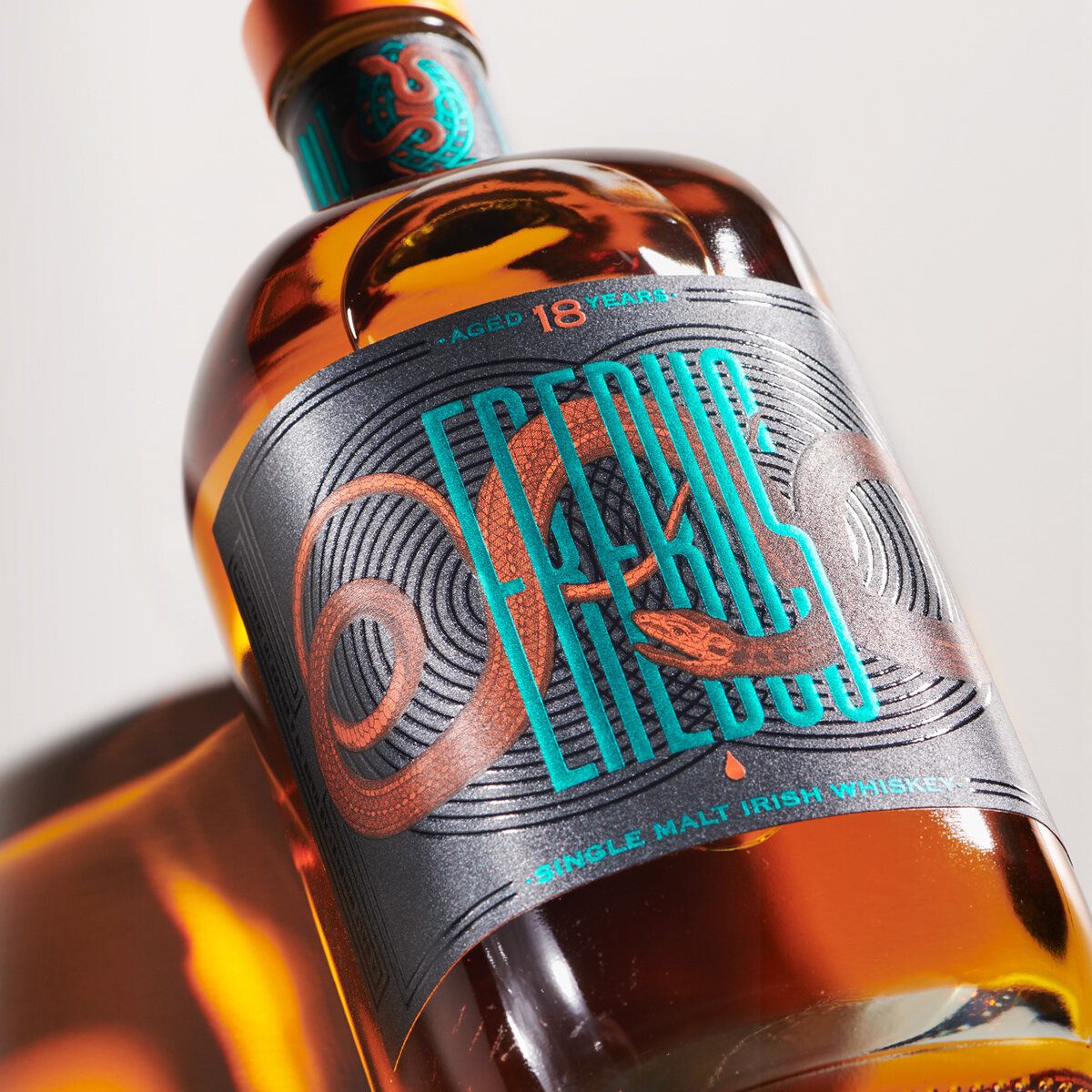
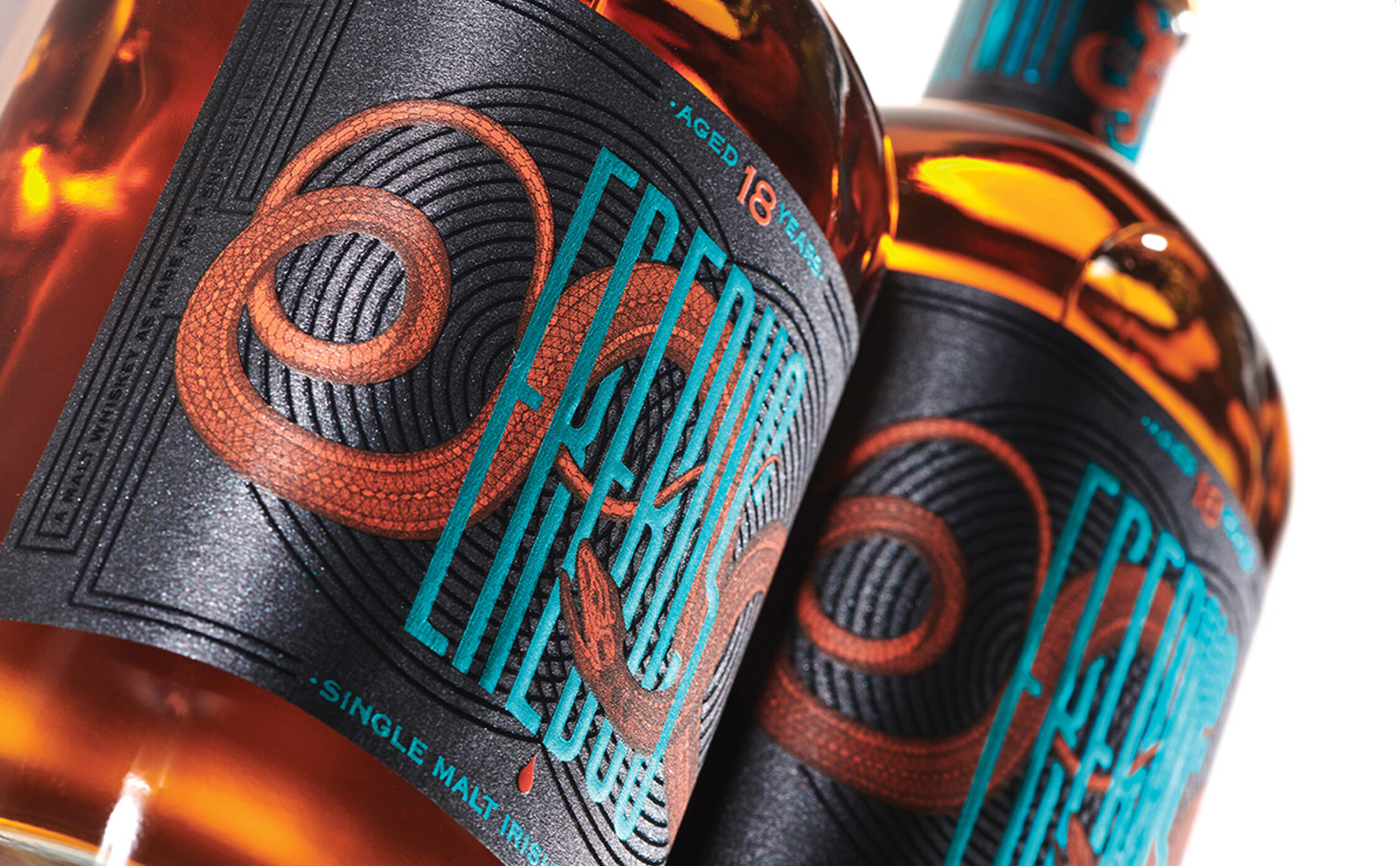
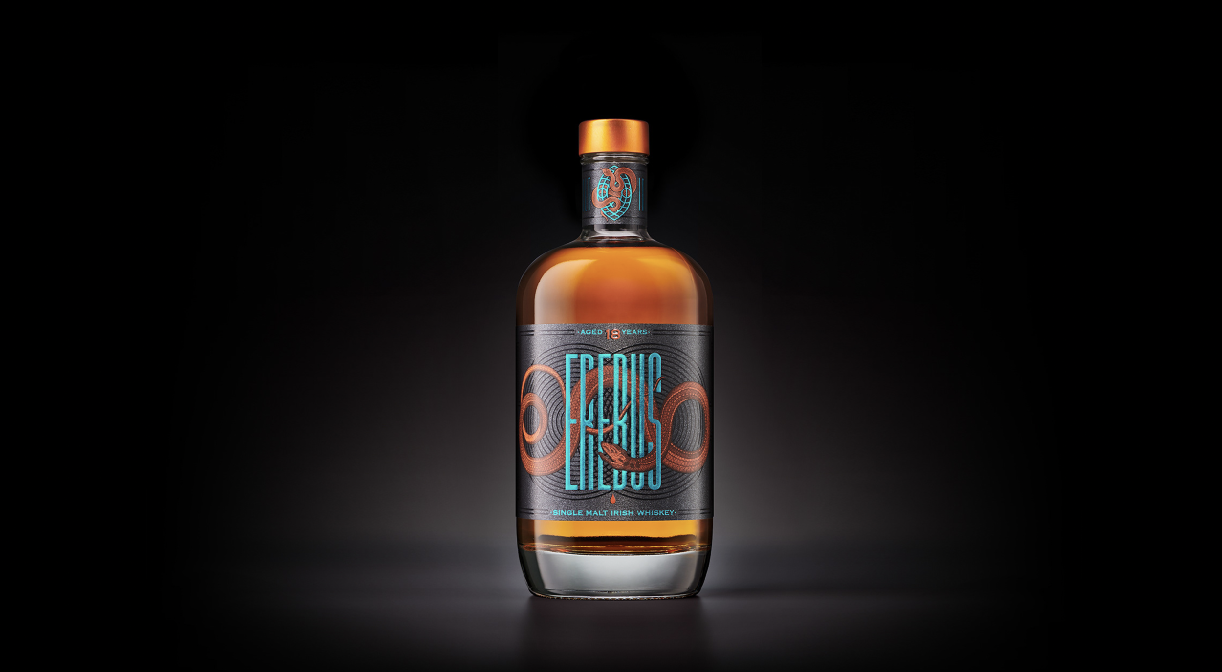
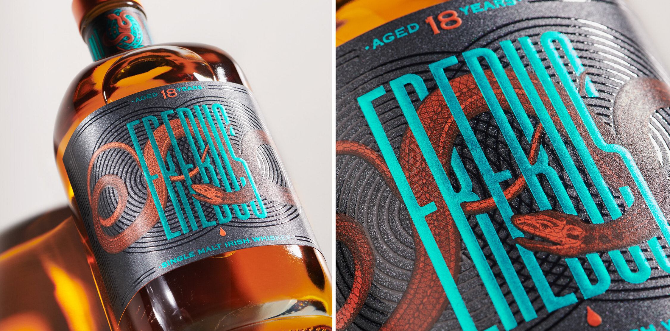
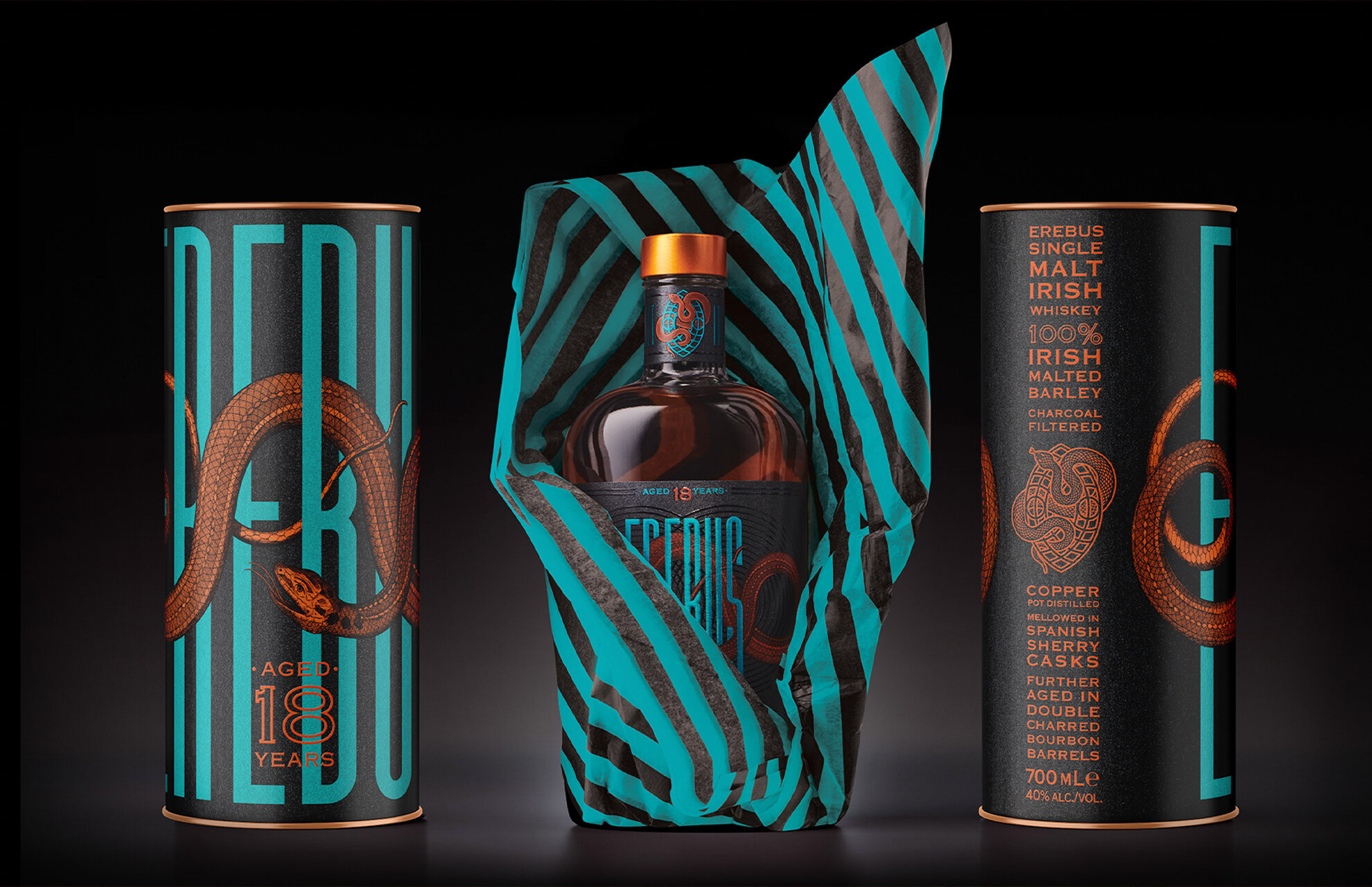
The brand was designed for a shimmering charcoal pearlescent metallic paper and called 'Erebus' to highlight the label stock’s dark lustrous appearance and its name, ‘Coal Mine’.
The sinuous snake is also an ironic reference to the apocryphal tale of ‘there being no snakes in Ireland’, alluding to its uniqueness with wry humour.
It is only when you look into the darkness, you see the light.
Client: Spicers Paper/Harcus Design
Design/Typography/Illustration: Jaimee-Lee Field
Creative Direction: Annette Harcus
Gold - Packaging, Graphis Design Annual 2021
Merit - AGDA Awards 2020